ShopDreamUp AI ArtDreamUp


Suggested Deviants


Suggested Collections


Comments91
Join the community to add your comment. Already a deviant? Log In
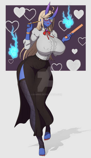
I just want to say that I really like how you drew Matilda. <img src="e.deviantart.net/emoticons/b/b…" width="15" height="15" alt="
In fact, your Matilda pictures are sexy. <img src="e.deviantart.net/emoticons/s/s…" width="15" height="15" alt="
What I like about her is the way she looks, and she's got style. Also, I like the way her breasts are at this view. You've done a great job on this character. This fits her perfectly Your other character Vanity (bunny girl with blond hair) can be like her, too. <img src="e.deviantart.net/emoticons/s/s…" width="15" height="15" alt="
I'll be happy to see more of Matilda and Vanity. They're sweet, and they rule. <img src="e.deviantart.net/emoticons/b/b…" width="15" height="15" alt="
Keep up the good work.
Well, that's my first Critique. HEHE! XD